

")
 Traditionally three main methods of creating rates graphs are singled out: linear, with bars or candlestick charts. Of course there are some other methods of creating rates graphs, such as noughts and crosses and other unpopular methods.
Lately candlestick chart has gained great popularity. They have appeared in the Western world recently – in 80-s, in contrast with linear and, standard for American markets, bar graphs. However in Japan, where they originated from, these charts have been in use even before the creation of share markets, when analyzing trading of primary products.
The candlestick graphic analysis was “founded” by Steve Nisson who wrote the book “Candlesticks. Graphic analysis of markets”, where he described means of building candlesticks and methods of analyzing the market, as well as the main graphic patterns of candlestick charts.
The candlestick chart is a sum of candlesticks that like the bars are built on the basis of specified time slot (a minute, an hour, 4 hours, a day, a week, a month or any other).
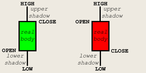
Japanese candlesticks have the following characteristics:
Opening price- the value of the earliest rate at chosen time interval.
Closing price- is the value of the latest rate at chosen time interval.
Maximum- maximum value of the rates within whole time interval.
Minimum- minimal value of the rates within whole time interval.
A candle body is formed as a rule between the opening price and closing price of candlesticks. In case the closing price happens to be higher than the opening price, the candle body is white, and in case the closing price appears to be less than the opening price, the body will be black. With this simple color method the dynamics of rates are demonstrated within time interval.
The maximum and minimum determine the length of “shadows” (vertical lines from bodies).
Thus the daily chart of EURUSD will include the set of candlesticks, each of them reflecting one separate day.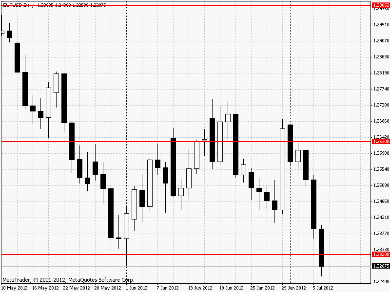
Due to its two-colored design, Japanese candlesticks give instant analysis with information on the rates increase and decrease at a given time interval.
But candlesticks became popular not because of informational content of price fluctuations on market that they provided, but because of graphical analysis on its basis.
Candlestick chart analysis consists of time-proved candlestick patterns. The following classical models of candlesticks reflecting trading patterns, may be singled out.
"Doji candlestick"
Doji candlesticks are the candlesticks with very narrow bodies (ideally doji candlestick is when an opening price equals closing price).Doji candlestick symbolizes instability of market sentiment. And the longer the shadow of Doji candlestick is the more active the resistance was between bears and bulls at this time interval. Doji candlestick is a strong turning signal when it is higher/ lower than candlesticks that are nearby.
The signal is considered complete only when all three candlesticks are closed, or the signal may be invalid.
Doji candlesticks are considered a strong signal but a very rare one, therefore a more wide-spread signals are used in a similar way- hammers, that also demonstrate tendency changes. Hammers have a small body (white or black), that is situated at the upper part of price range of a session and a very long lower shadow. The upper shadow is very small or is missing. If this candle appears in the time of descending tendency it becomes a bull hammer and vice-versa. The ideal hammer has a lower shadow that is at least twice the size of the body. The long shadow characterizes the break in tendency inside the trading session, which is confirmed by the following candle. Inverted hammer has a long shadow upwards. The inverted hammer better denotes the change of ascending motion by descending one, and the hammer denotes a change of descending trend by ascending one. Traditionally the hammer at the top was named “ hanging man”.
The candlestick pattern- "engulfing" is more popular but is less significant for candlestick chart analysis. This candlestick pattern is formed when the body of current candle absorbs fully the body of previous candle (it is better, but not obligatory with shadows). Besides candles have multidirectional movement. The signal is the most powerful when the body of current candle is considerably bigger than the body of the absorbed candle, since that means that the new tendency became more powerful than the previous one. There are “bullish engulfing” (when the black candle is absorbed by the white one) and “bearish engulfing” (when the white candle is absorbed by the black one).
Engulfing patterns are pretty popular and they give many false entries, that is the reason they should be utilized in the line of main tendency.
We have considered only the main and the strongest patterns of candlestick chart analysis for forex market. There are many candlestick instruments but despite many patterns, candlestick signals are of a probabilistic nature, and the trader in addition to correct interpretation of a given candlestick pattern must conduct risk-management of every signal, choosing the most attractive ones.
Graph analysis using candlestick patterns allows seeing the change of tendencies better than any other indicator. That is why any trader must learn basic skills of candlestick chart analysis.
It is important to know that candlesticks perform the best on daily charts. Candlestick chart analysis on smaller time intervals can lead to substantial growth in false signals.
Social button for Joomla